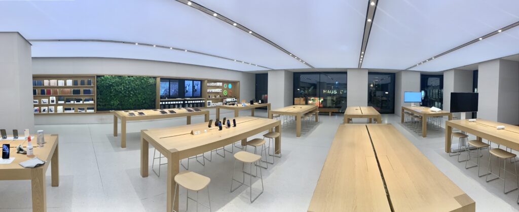
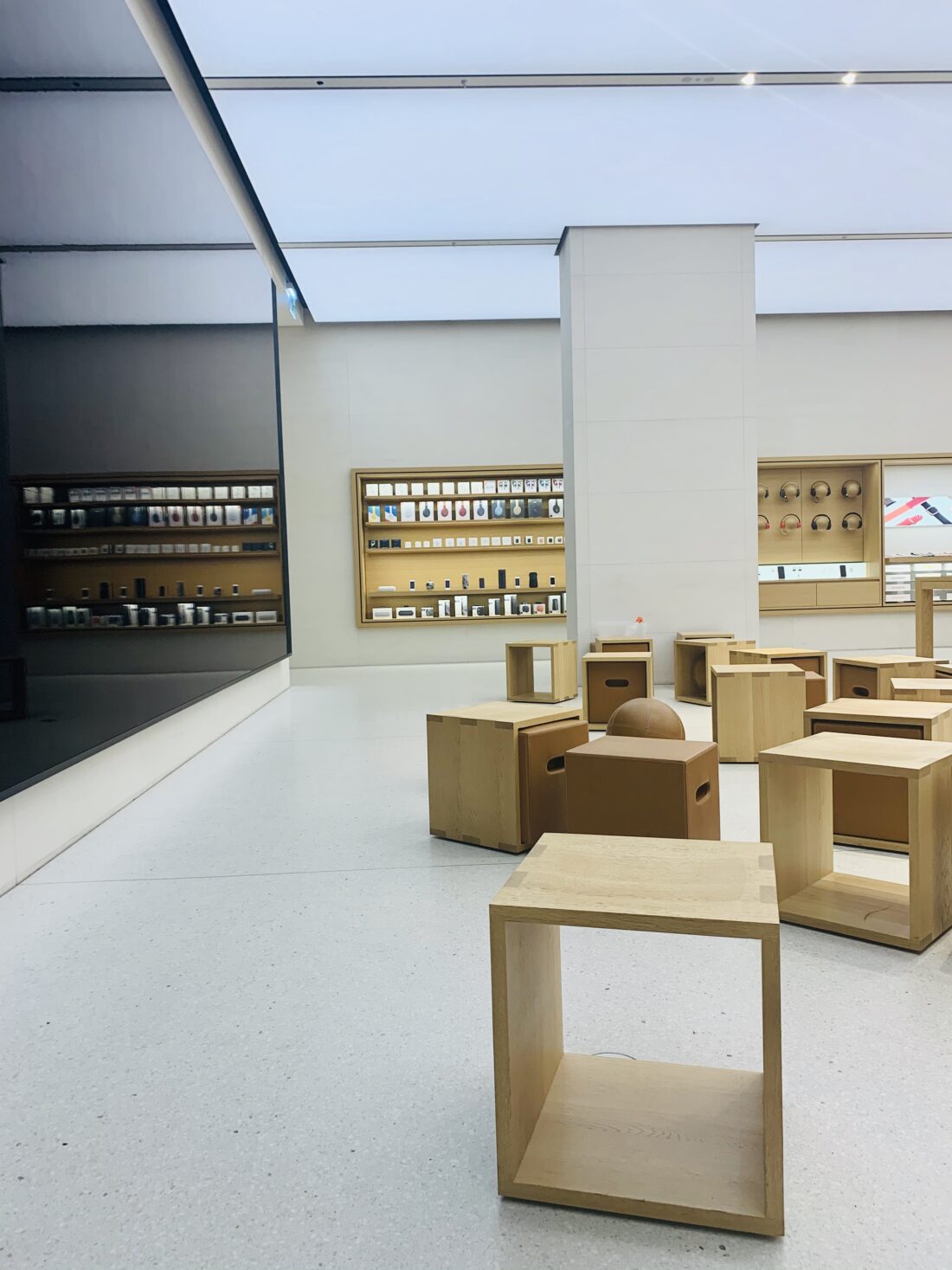
The thinking behind the design of the Apple Store Vienna
As an architect, I have developed this job characteristic, of deconstructing the space thoroughly in my mind everywhere I go and try to understand what the interior design is trying to tell me about the brand. Here are some thoughts that occurred to me while looking at the Apple Store Apple Kärntner Straße.
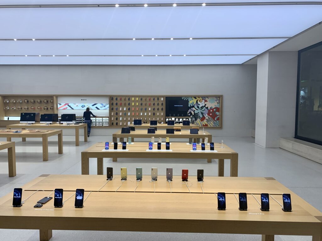
No shop window display. The Apple store does not display its products in the window like other shops. But it does give you a great view of the “marketplace” atmosphere of their shop. People are buzzing around their tables, testing their products, and as it happens, everyone wants to be where other people are.
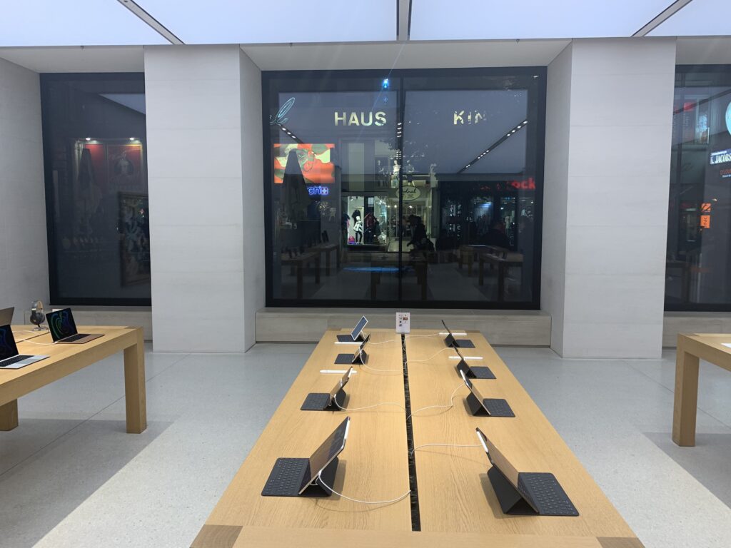
Marketplace atmosphere. All the products are displayed on tables, allowing people to go around them, have a closer look, and compare. The entire setup reminds the visitor of a marketplace. A very familiar setup.
Clarity of space. All the spatial composition elements are on one surface. The ceiling is not composed of a number of spots, but it is a light surface. The wall in the back is covered by a screen on (almost) its entire surface. The floor is a uniform colour in the entire shop. The tables and the chairs are the same colour. All walls are the same colour. For the brain, it is very easy to deconstruct the space in our head. We understand it easily, and we feel safe.
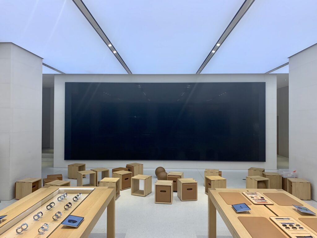
Light, natural colours. Light colours support the reflection of natural light all the way to the back and make it easy for the eye to understand space. A light floor usually makes the space airier and more flowing. The shadows that hit the ground are not so hard. The glossiness of the screen, as well as its size, speaks volumes about the technological power of the brand but also supports the “classiness” of the entire look and feel.
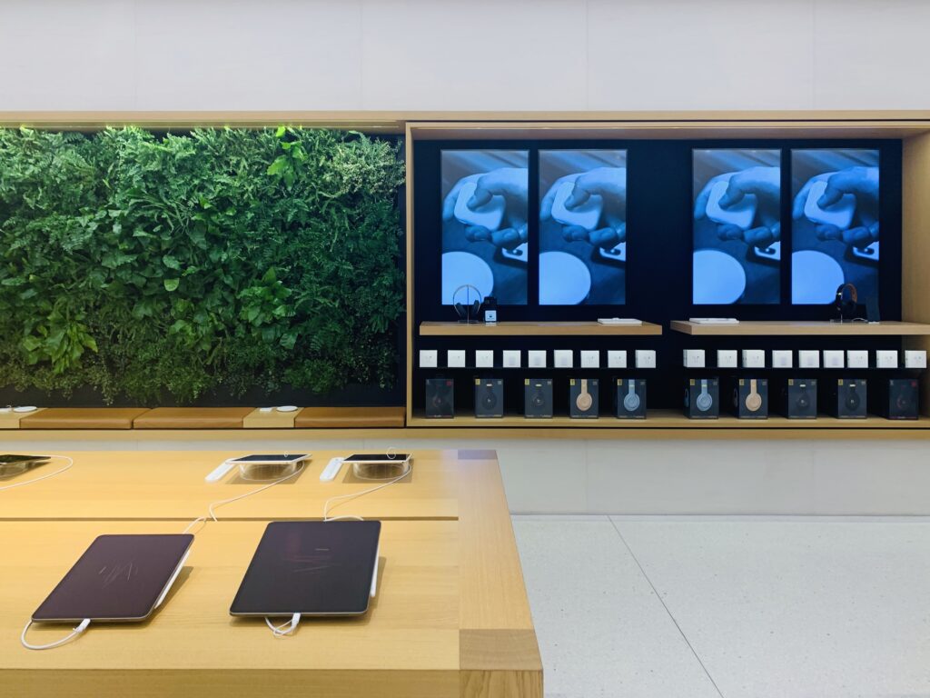
Biophilia. It’s been a recognized phenomenon, that nature, has a soothing and calming effect on people; this is why the “Apple Store” is willing to “sacrifice” some of its display areas, in order to make you feel more comfortable, as well as speak volumes about their eco-friendly measures to support sustainability.
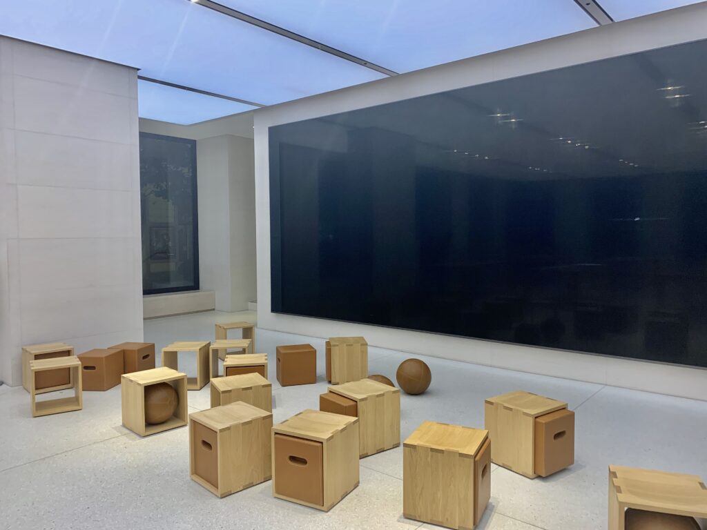
Playfulness. It might look like the Apple store might have run out of money and forgotten to put some proper chairs in the space. But that is not at all the case. When was the last time you sat on a wooden box or a basketball? Probably when you were a kid. And it’s that childhood feeling that they want to remind you of, attached to their identity as a playful and innovative brand.
The use of lines and symmetry. Do you notice how the lines on the ceiling match exactly the table’s edges and centres? That is no coincidence. Using lines makes it easy for you to understand the space and how deep it is. Also, many of the perspectives of the shop make use of symmetry, and we all know how much the human brain loves symmetry,
